carlyn yandle
  • about
  • crafted objects
  • public art
  • painting
  • the creative process
  • exhibitions
  • contact

From a five-year-old's paintbrush to my soul

9/20/2013

Comments

 
Picture
What movie first rocked your world?, someone asked during a recent dinner with friends. Easy: 2001: A Space Odyssey, said one. Looking for Mr. Goodbar, said another, clearly remembering her fear.

Mine was The Wizard of Oz. Never mind the munchkins and the flying monkeys; I was captivated by the black-and-white horror of the dustbowl twister, the gleaming-gold yellow brick road, the brilliant glassy cluster on the horizon that was the first glimpse of Emerald City.

So when my nearly-six nephew, also a bit of an obsessive Wizard of Oz movie fan, showed me his latest paintings, all I could think of is: I feel you.

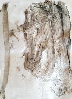
I look at the thick column of furious grey strokes going in all directions and immediately zone into his own fearful recollections of that part in the movie as he attacked the paper. That ability to connect the intensity of feeling by the maker to the viewer is the basis of successful art. Wow, I said. I can really feel that. 

Picture
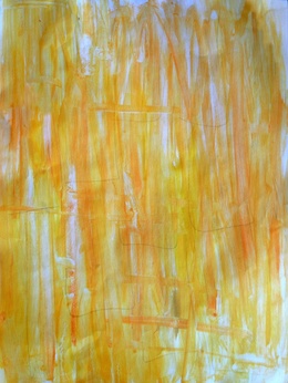
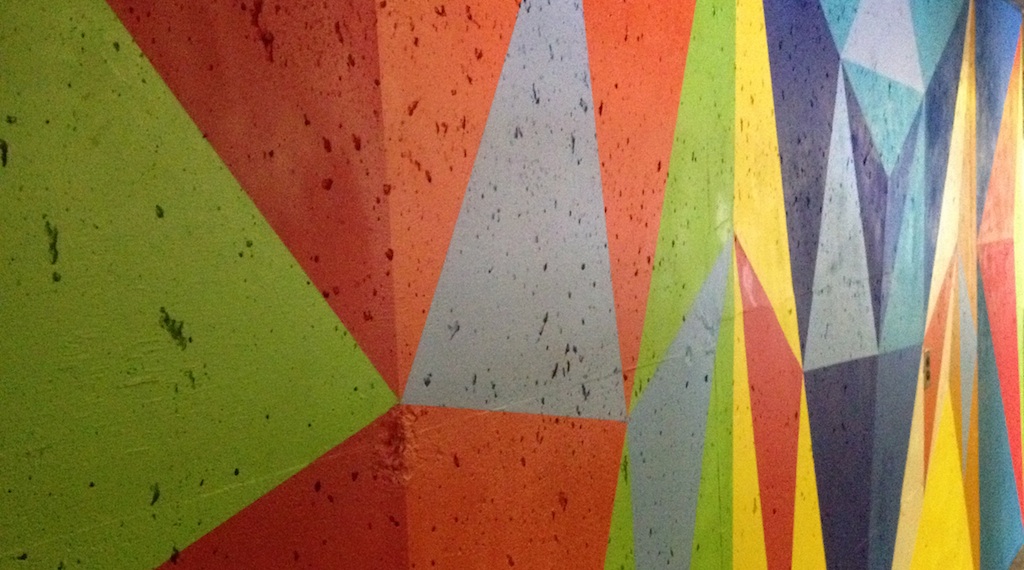
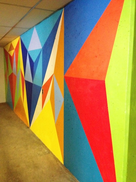
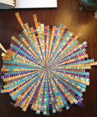
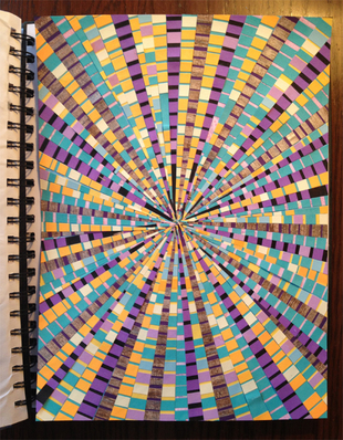
I was thinking how great it would be to feel the twister myself, using ink on hand-pressed paper and maybe actual dust, while he trotted back to the kitchen and retrieved Yellow Brick Road. The field was filled entirely with almost mechanical vertical strokes in different shades of orange, yellow and gold, with intersecting strokes to form a grid that ran off the paper, suggesting an endlessness. 

Wow, I said again, thinking already how it might look actual road-size, using rollers on stretched canvas.

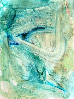
Back he went, returning with Emerald City, and by then I knew this kid was really onto something. Unlike his drawings, which are these days more narratives involving figures and recalled landscapes, or — my current favourite: a bird's eye view of a baseball game — this series was expressed feeling-first. Not so much on telling the story but recalling the feeling, through colour and stroke. 

Picture
Kids have so much to tell us about what not to do when staring at a blank canvas. Maybe not so much with the analysis, the second-guessing, the pre-planning, the systemization. 

Just attack. Jump right in. Look at each stroke as it's going down and  do not bother yourself with committing to spending more than a few minutes on it. You may not feel the urge to let a puppet take over the paintbrush or let your inner Scurvy Pirate out for a song but it's good to wrap it all up in play. Like another friend, a modest but gifted artist likes to say, "I'm just playing."

My nephew's paintings remind me not to be so precious about the results. It's about the making, not the amassing. Only the adults care about keeping them.

I can see some auntie-nephew collaborations down the yellow brick road.

Picture
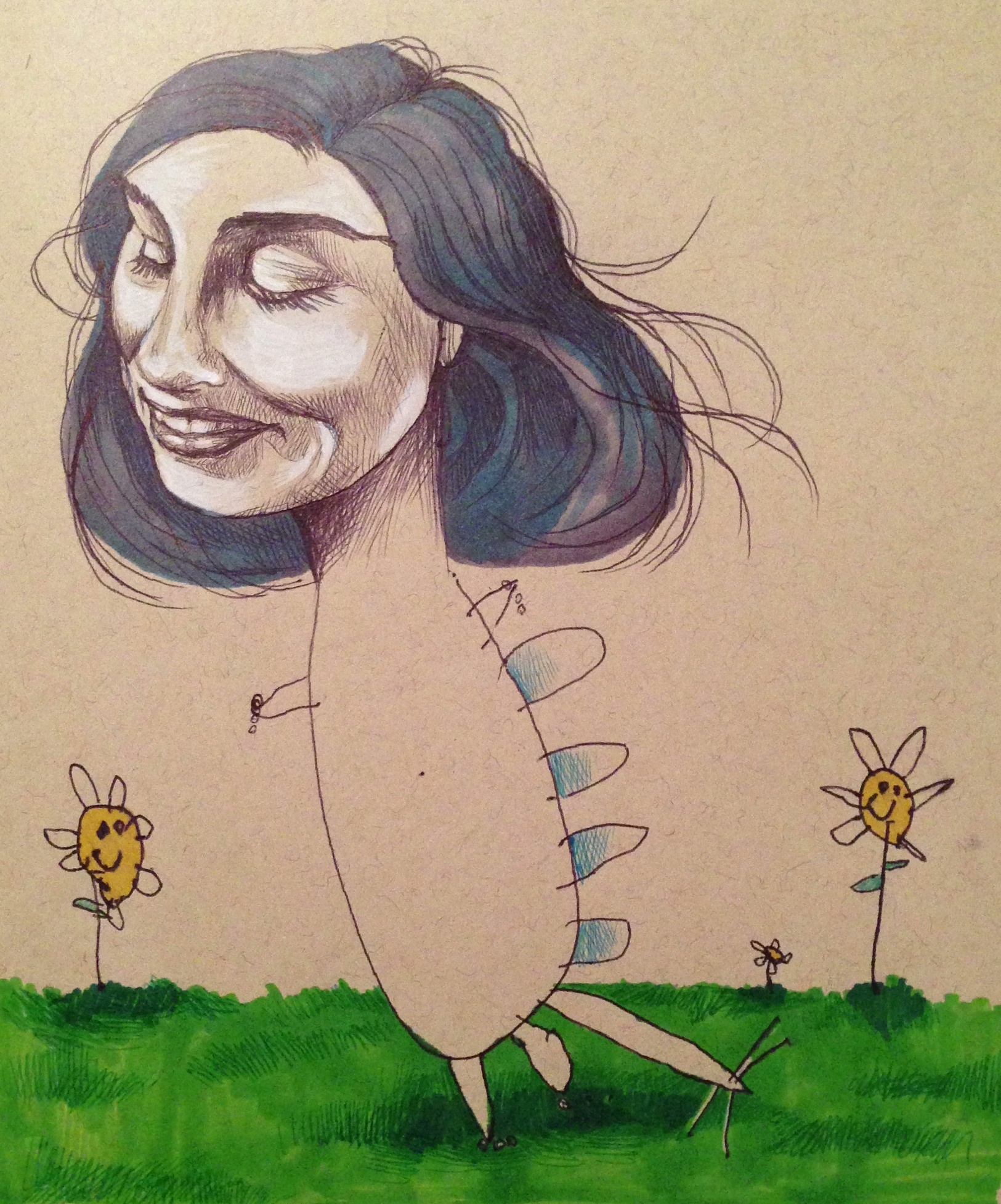
American illustrator and graphic artist Mica Angela Hendricks writes about the world that opened up for her with she began collaborating with her four-year-old.

Her blog updates her creative process that is challenged by her daughter with her own ideas. 


Comments

How not to pass out While Painting

9/6/2013

Comments

 
I could never understand why the armies of construction workers in this town would head for the Wendy’s or Burger King over a nutritious, fresh soup and salad next door. That was before I started spending long days under a respirator spraypainting in a cavern of concrete. When you’re involved in continuous sweaty, labourious activity, you’re not about to squander your one meal break waiting around for little bits of things to be arranged on a plate. This is no time to pick your way through a Whole Foods buffet bar, then line up at the cashier. You need to mainline those big fatty, sugary, caffeinated calories. Now.
Picture
A daunting, dark space takes on new life as a geometric colour field.
PictureMy purple man's business shirt has it all covered.
This is just one of the ah-ha moments that came to me during Phase I of the Parkade Painting project. Another big learning moment: carbon dioxide can wreak havoc with the logic centre of the brain, which in retrospect explains a lot of stoopid mistakes I made in the process of turning a wide expanse of concrete into a geometric colour field, like forgetting pattern choices and mixing up colours. Turns out that carbon dioxide builds up in the mask over time so you — and by you I mean me here — have to come up for real, non-fumey air at least once an hour.  I should have solicited advice from my encaustic-painting friends on this one before I got to the point where I was staggering around, forgetting the whole purpose of spending these last summery days in carcinogenic clouds of propellants and other nasty chemicals I can’t pronounce.

I like the risk of taking on a daunting project of a scale not normally tackled by a five-foot-two female but I’m risk-averse to exposing myself to a toxic environment so except for the no-breaks slip-up, I’m serious about suiting up for the task at hand. In this case that means protecting the largest organ — the skin — from exposure. Here, the Smart Girl’s Guide to Spraypainting in the Summertime:

1. Cover it all. If you’re of my stature you will search but never find Carhartt coveralls that fit your female frame, and Home Depot’s one-size-fits-all disposable painting jumpsuit just doesn’t have the majority of the people who do home painting (women) in mind. You will have to improvise. I wear a (particular) man’s business shirt over a workout top and loose cotton pants. The cuffs and top-buttoned collar has it covered, plus the breast pocket is perfect for storing gloves. All this goes over light cotton pants and runners.

PictureOne day of painting shows particulate trapped in a cartridge filter.

2. Speaking of gloves, I like the snug, waterproof Watson gardening gloves, because you won’t find painting gloves in your size at Home Depot. And disposable gloves and painter's tape are a bad mix.

3. Respirator and Safety glasses. These should be viewed as a two-part must-have unit. Silly dust masks are for chumps. We like our brain cells. If you can smell the chemicals through the mask, it’s not working, but that’s not to stay that the cartridge is not done. It’s hard to predict when a cartridge should be replaced but I switch out the filter pads as soon as they look less than pristine and change the cartridges as I'm psyching myself up to embark on one of these harebrained art schemes, which is about once a year.

4. Head scarf. I tie it snug and low around the forehead so it meets the top of my glasses. Spraypainted hair is nasty.

Now onto Phase II....

Picture
Only artist-quality spraypaint can handle the pits and scars of industrial concrete walls.
Picture
Comments

Ask not why the giant doily

5/2/2013

Comments

 
Picture
After a long and often painful labour, I’m happy to introduce…the twins!

I’m not sure why I plumped up the two eight-foot-wide doilies, freshly completed today, for their first picture. It might have something to do with this morning’s mammogram.

‘Why’ is always a scary question wherever conception is concerned. ‘What’ and ‘how’ are a little more manageable.

What they are are two crocheted doilies on a scale of 1 inch = 1 foot, using a material that mimics the relative volume, appearance and weight of the cotton floss called for in the original patterns for the two table-top doilies I found in my stack of 1950s homemaker magazines.

Picture
What material was a tough enough question without the Why lurking behind. I’d been searching for the right stuff for ages until I realized it was all around me. In fact, I’d been hammering cedar shingles into it for weeks at a time last summer: Tyvek exterior building wrap. I pushed the Why away as I special-ordered a 100-yard bolt of the wrap.

The size of the doilies was determined by the biggest crochet hook I could get my hands on (and could handle). After making several swatches I finally decided two-inch strips were sufficiently doilyish.

Scraping up any residual knowledge of basic math that has clung to my grey matter, I have conjured up this probably-incorrect calculation of length of materials used, in answer to the What:

Picture
36 inches (1 yard width) ÷ 2-inch strips = 18 strips x 60 inches (length) = 1080 linear inches per yard x 95 yards (100-yard bolt minus remaining five yards) = 102,600 linear inches ÷ 12 inches = 8,550 feet ÷ 2 doilies = 4,275 linear feet per doily. (I love how stats can be simultaneously unfathomable and banal.)
How did I know how to make doilies? Let me count the ways in all those crappy/crafty afghans, potholders, slippers, placemats, doll clothes, stuffed animals, toques, nerdy vests and that abortion of a bikini.

Why the giant doily, you/I insist? Because it was there, in my head. I conceived two to enjoy their similarities and their differences.

Go forth, twins! Find your purpose! Write if you get a show! And don’t let the why-ers get you down!

Comments

A creative solution to a hoardy habit

1/25/2013

Comments

 
This would be the sequel to the New Year’s resolution post a couple of weeks back, in which I vowed to part ways with years of art projects from past classes and phases, and future artworks that just are not going to happen.

I used to help people shed their clutter for a living, so how hard could it be to take my own advice? Clear the decks and clear the mind, yada yada.

But it really does feel like a bit of my soul is being destroyed when I finally get down to chucking out a drawing or a collage, or face the strong probability that I will never master weaving or silk-screening. I know something has to give or I will be Rusty in Orchestraville, that annoying kid from the ancient record of the same name we had growing up. (Rusty kept switching instruments so he never mastered any one, and got kicked out of band. Or something like that.)

The Buddhists would say that it’s important to let go of material objects and the ego embedded in them, but I also see there’s something to learn from those past studies and explorations, so I’ve come to a workable compromise.

Thanks to one of my favourite art school instructors who required we keep a well-stuffed sketchbook for our Creative Processes class, I’ve kept up the habit. It takes me about a year to fill a spiral-bound hard-cover sketchbook with my notes, clippings, found things, sketches, pattern studies and painting tests for bigger artworks. The collection of bulging books are more important to me than any particular painting or sculpture because I refer back to those ideas and bits of inspiration as I move forward.

Cutting a section out of a painting and gluing it onto a sketchbook page feels like cutting my ego down to size. I get to keep the idea without the fetishistic need to hold on to every little thing just because I made it. 

Who knew letting go could feel so good?

Picture
BEFORE: Transforming plain cardstock paper into a multi-coloured burst pattern was a useful exercise but the finished project was just hanging around, taking up space.

Picture
AFTER: Cropping the piece and gluing it into the sketchbook gives it new dimension: a process to refer to in the future.

My sketchbooks are a happy mash-up of miscellaneous studies and processes, half-baked ideas and doodles. Weirdly chronological, they might have something to tell me down the road.
Picture
Picture
Picture
Picture
Picture
Picture
Picture
Comments

Creative collaboration takes physical feats to new heights

1/4/2013

Comments

 
I got the gift of a visual feast for Christmas: a date to see some performance-art mastery by Cirque du Soleil. And it was no less a sensory experience than the first show I saw when Alegria debuted in Vancouver in '03.

Amaluna also has an operatic storyline but I looked past that to better focus on the abstract. Narratives can be distracting, in the same way that lyrics in music distract me when I'm in the middle of a creative process. Instead, I let the spectacle of sound, light, and unimaginable feats of the human form wash over me. 

I was close enough to the stage to feel the velocity of Olympics-level gymnasts in fiery costumes swinging through uneven bars while others scrambled below and pushed them into the air, in a kind of choreographed chaos in the dark void, set to a hard-rock soundscape and mesmerizing light show.

This is my kind of Olympics. All of the technical ability but none of the brutal, singular competition and nationalism. No instant-replayed technical errors, no ranking, no tears, but instead a slightly psychedelic viewer experience of human physical and creative potential.
Picture
Acrobatic coach Stacy Clark told thestar.com that she challenges the highly trained gymnasts to find ways "to strip away some of the intense discipline they had as a gymnast and turn it into a much more expressive experience."

I could see it on the faces of the mostly female cast from as far as China, Japan and Russia that they were fully engaged. Some of those talents were not found in elite training schools but  in the world's most egalitarian performance space: YouTube. 

Picture
Compared to Cirque, Olympics gymnastics — and the whole Games — feel too hard-core, too political, even fascist. 

But I have to admit I'm a little puffed up with nationalistic pride myself as this wildly successful French-Canadian company displays new possibilities for showing off what bodies can do in creative collaboration.


A taste of Amaluna:
Comments

A brilliant painter's life, interrupted

11/30/2012

Comments

 
Picture
Metropolis (2007), acrylic, charcoal, porous point marker on canvas, 84” x 132”


Ignorance was truly bliss when I spotted this staggering, large painting at the AGO last month. I didn't know of the artist, so I viewed it at face value, no back story. It was the only photo I took during my luxuriously long, first-time visit to the Frank Gehry-redeveloped gallery. I needed more Denyse Thomasos.

The painting hits as a visual mash-up of Leviathan nightmare and architectural chaos, created with a free, confident, skilled hand. Art can do that: have you gasping in front of what is just canvas and markings. It can rock the centre of your being or reinforce exactly where you sit in the universe at that moment in time. Maybe this is what they mean by having an out-of-body experience.

Some post-viewing googling unveiled the tragic news that the artist Thomasos, born in Trinidad and raised in Canada until moving to New York in 1989, died this summer "after an adverse reaction to a dye injected for a routine MRI," according to a statement at the Olga Korper Gallery, where her work has been shown throughout her professional life as an artist. She was my age, recently married, a mother.

An important Canadian artist with an international reputation, a professor at Rutgers University in New York CIty, Thomasos has since had many news stories written about her work and her life, interrupted.

Her brilliant paintings, which deal with heavy themes ranging from super-prisons to slave ships and rampant globalization, are left to speak for themselves. 

Here are a few examples, and an interview, where Thomasos generously explains her process:

Picture
Untitled, 2012 acrylic on canvas 48" x 60" (Image courtesy of Olga Korper Gallery)
  

Picture
Arc 2001, acrylic on canvas 48" x 60" (Image courtesy of Olga Korper Gallery)
  

Comments

The genius of keeping things open

10/26/2012

Comments

 
Picture
It's a tricky business, doing a public-art commission for a private corporation, especially when there are big strings attached to the cash: the thing has to salute the business itself.

The really tricky part is creating something that doesn't pander to the payer because, well, that just ain't art.

Which is why I love Infinite Tire, the newly installed cast aluminum 60-foot tower by Douglas Coupland, at the new Canadian Tire mecca on south Vancouver's Marine Drive. 

Like Coupland, I spent my early adult years in print media negotiating the ad-driven war-zone of sales and editorial. While the ads drive the business and the sales reps relentlessly lobby for profit-motivated editorial content, good writers quickly learn how to create engaging stories that don't spoon-feed readers but provide space for them to exercise their own faculties of judgment and reason.

This is how crafting the story connects to crafting the concept for an artwork. While Infinite Tire may seem an obvious salute to an icon of a ubiquitous Canadian store — its own MotoMaster tire —  it could also reverberate as a statement about the never-ending line of climate-changing motor vehicles that defines our times, reaching up into the threatened atmosphere. Or it could be just a celebration of scale, repetition or whimsy, as hinted to in its title that plays on Brancusi’s Infinite Column.

Picture
The reading all depends on your own sensibilities. Not surprisingly, I immediately connected this sculpture's physical open-ness to lacy openwork: crocheted pattern through negative space.

There's a lot of room to play in that open space.

Comments

Revelations from the 'Revelation' and other scary rides

8/23/2012

Comments

 
During my first day of art school, one of the instructors told the auditorium packed with other nervous Foundation-year students that this education would be not just about making the art, but making the artist; the art makes the artist. I wrote that one down because I didn't quite get it.

Two years out of art school, I'm starting to see the strong role that the formative years — that critical time that shapes adult sensibilities — plays in artwork. I've always viewed my formative years as being the year-plus I lived in Japan in my early 20s. There was this big sensibility shift, a re-arranged outlook. Living and working in Kyoto helped shape my aesthetic, an appreciation for the spare and the pure, and I've since been hanging onto that, like that one ad slogan that was plastered all over the subway stations in typical Japanglish: "Enjoy your simple life."

But I can't ignore the fact that my work is emerging as anything but simple, pure or meditative. It's more likely chaotic, restless and a little disturbing. At least that's what they tell me; I find that jarring colour and pattern interruption kind of soothing. So where does that come from?

Sometimes you can be too close to the tree to see the forest, or in my case, the amusement park. I had wrapped up a week as on-site coordinator for the PNE's Container Art show last week before I realized my brain was revving up as the tarmac filled with trucked-in rides. I felt the joy-joy-joy at being surrounded by all these circular patterns of chaotic colour, a sort of comforting exhilaration.
Picture
Picture
Psychedoilia: Nine Patch, 2011. Acrylic on canvas, 72" X 72"
My childhood neighbourhood was at the doorstep of Playland. This was where I learned to make tight spins at Rollerland under the dizzying  mirrorball patterns, and drink in the screams and neon lights on summer nights, ticketless and behind the chainlink fence. I watched greaseballs brawl on the midway as we churned on the Octopus, and heard the trample of horses racing for their lives. Here is where I had my first kiss, worshiped a red-leathered Freddie Mercury bathed in pyrotechnics at the Coliseum. These were also formative years: a mash-up of danger, risk, overstimulation, desire and a strange sort of nostalgia.

Now I'm seeing it. 


Comments

Pushing the work, with a little help from my friends

7/18/2012

Comments

 
You'd think the biggest challenge of artists is deciding what to make. But every artist I know is challenged by deciding what not to make. There are so many competing pursuits that tend to be part of the lives of creative types: gardening, music, cooking, hanging with kids and animals, communing with nature, going to art shows and performance events. So many things we'd like to dig into, so little time.
Deciding what not to make is sort of essential if you want to get any one thing actually made. There's a big, delectable smorgasbord of potential projects and processes out there and as much as I'd like to throw a clay bowl/solder silver jewelry/silk-screen/arc-weld/blow glass/wood-turn (etc.) I need to stick to a diet of work that moves my major focus forward. So I resist the temptations of reconnecting with my old Pentax ME SLR camera or singing in a group, but I do allow myself to collaborate with other artists on smaller, ongoing exercises that push my fibre/pattern-based abstraction obsession.
Which is how my friend Val and I got the idea of starting Co-Lab a couple of years ago. This involves us each doing something  to a 12-inch-square wood panel, then swapping panels so the other person can add (or take away) an element or layer, then swapping again. And sometimes again. Sometimes we go too far, and there's no going back. They are un-pre-mediated and rarely pretty, but who said pushing one's comfort zone is pretty? The results are often quite monstrous, as illustrated here with a panel we called "Monster":
Picture
WIth only 'blue' as our over-riding theme this year I covered a panel with painted relief-work, as I was exploring casting possibilities of acrylic paint and different distressing methods.

Picture
Val immediately thought 'reptilian skin' so added a cycloptic eye and feet evoking Eastern spiritual traditions, a theme that connects much of her assemblage work.

We've completed several panels but whether they'll ever see the light of day is beside the point. We post them on a private blog simply as a way to record the processes - the good, the bad, and the ugly.
Currently I'm collaborating with two other groups of artist friends. Mixing sculpture, painting, drawing and assemblage are not always easy, but there's something to learn in each of those mash-ups.

Comments

Unravelling the mystery of an unravelling rug (It's a lo-o-ong story)

3/25/2011

Comments

 
Picture

Design has the most to say about the origin of what is commonly known as an Oriental carpet. But the patterns woven into a mysterious tattered, dun-coloured wool rug that has been in my family for as long as I can remember have led to more questions than answers.

My mother purchased the rug in 1969 at a Salvation Army thrift store in East Vancouver. As a long-time social justice activist, she was attracted to the two major central designs in the rug. They looked to her like bombs, and she was attracted to the notion that it may have been made in creative reaction to the war-zone region where it was woven.

This curious design saved it from an uncertain future 40 years ago, and saved it again during a recent “shoveling-out” of the old family cabin. Aside from the two bomb-like figures there are other mysterious pattern features: dark indigo lines of arrows that appear to point in specific directions; an intriguing, restrained use of white as a border highlight; faint yet distinct lines of pattern resembling field rows. The ‘bombs’ themselves are marked by subtle differences, including the fact that they are not the same size.

My general, limited knowledge of handmade area rugs told me at first glance that this was, at the very least, an Oriental rug, due to its pattern of a border surrounding a central field. It was also likely tribal, due to its asymmetrical dimensions — 80 centimetres at one end and 100 at the other — indicating it was made on a small, simple and probably transportable loom. It was also likely an important size to its nomadic makers; at just 170 centimeters in length and an almost brocade-like thickness, this lightweight carpet packs easily. The colourway reflects the largely barren region of the largely nomadic Central Asia, at least prior to 1969. The lack of saturated colours indicated that the wool might have been natural, from animals that would have been important for nomadic peoples such as camel, goats and sheep, or would have been dyed using natural plants or minerals found or traded in the region.

But it is the simple, abstracted geometrical patterning that is the most compelling indicator of its roots in rural Central Asia, as opposed to China, India and Persia where the complexity of those stable cultures is representative in the largely floral, ornate patterning.

Pattern would provide both definitive answers to location, but also more questions about how complex ideas of culture, the physical environment and the mystic can be embedded and encoded in deceptively simple patterns.

My hunch was that this was a prayer rug, and the ‘bombs’ were directional elements contributing to its purpose of orienting the worshiper toward Mecca.

Initial research did confirm that this was not a “war rug”, a highly collectible type that first appeared in the Steppes region of Afghanistan and northern Pakistan following the Soviet invasion in 1979.

So are these central features in the field known among collectors as the “main stripe” ships, buildings, fish? Anything resembling the images is at odds with the arid geographic location in which this rug was likely made.

Other than these two confounding images, this particular carpet resembles Turkmen rugs in terms of size and colours, however, the main stripe lacks the typical pattern of rectangular or octagonal ‘guls’ that many believe to be heraldic emblems. Also, its lack of a mihrab, or prayer arch, in the main stripe arguably discounts this as a prayer rug.

The simple abstracted geometrical border design of narrow frames, known as the guard stripe provides structure and focus in the same way that a frame highlights a painting but it is also the most useful part of a carpet’s design in determining place of origin. The border of the rug in question features a number of motifs, from a turret-like pattern, and a linking of triangles that may derive from the Tree of Life that is characteristic of all Oriental rugs including the strictly geometric pattern of Turkmen rugs. Any interruption of the flow of the pattern around the corners would indicate that the rug was copied from another rug or done by memory.

The fact that the dyes in my rug are essentially shades of brown, with navy and white used as outline connects it to the general group of Turkmen rugs, which are traditionally dyed with madder in shades that include browns and brick shades, and the limited use of black or dark brown outlines for to create subtle emphasis. 

However, the almost minimalist ground and subdued patterning points to weavers of tribal groups distinct from the Turkmen with whom they are usually associated. 

Research also reveals that the Balouch rug, also known as Beluch or Baluchistan, is often described as monotonous and drab. One blue and a small amount of white is typically used in contrast to a range of browns. This is an accurate description of my rug, which locates it within a people, but it is the one specific pattern set of the Balouch that is more intriguing.

The Balouch often incorporates the Tree of Life design, often on a camel ground, like mine. It may be an Engsi, a rug traditionally used as a closure on the tent-like entrance of nomadic dwelling, specifically a Khatchli design. Adding weight to that theory is the typical design of a Khatchli, which is Armenian for ‘cross-like.' A “cruciform paneling” essentially segments the rug main stripe into quarters and includes and “elem” panel at the bottom. The cross-like shape can be seen to mimic the panels in many wooden doors but also suggests a garden, according to one collector I found at a website on Oriental carpets.

This rug does seem to bear traces of the Khatchli layout, although without the elem panel. However, the two main images remain at odds with any examples shown in Khatchli rugs.

It was only after seeing an image posted on an online discussion board of a similar ‘bomb’ that I realized my rug was pictured upside-down. One collector/writer discusses this uncommon design:

“The footed vase design is referred to as Qalem Dani, or pen holder. Because of the protruding leaf forms, Westerners think of an upright holder for a quill or pen. The weavers more likely had in mind the Persian type of long, ovate, papier-mâché or wooden pencil box, richly ornamented with lacquer painting. It graphically shows how a pattern is simplified and then a specific element is extracted to become a major design element.”

The author says he believes the Yacub Khani sub-group of Balouchi weavers, who were not known for making prayer rugs, made the footed vase rug.

The arguments and theories continue, now more likely in online discussion boards dedicated to specific topics under the subject of the Oriental rug.

Three collector/academics at the most prominent non-commercial website for collectors of Oriental rugs I was able to locate weighed in on the rug and gave three different interpretations of the design. One suggested it was an Afghan rug featuring a design reflecting the narrow and pointed headstones of the area:

“The arrow-like devices could represent cypress trees, which have been associated with cemeteries for a very long time, or a fence around a tomb. Afghans and others visit cemeteries on their New Year. Some areas have a tradition of weaving a rug for the funeral and in Turkey many were then donated to the local mosque.”

Another agreed that it was likely not used for a door, also known as an “Engsi”, because it lacked the typical bottom panel design in the pattern. He theorized it was a Balouch floor rug, featuring an old design no longer used but roughly translated as “inkwell,” which may refer to the aforementioned “pen-holder” theory.

Another aficionado attributed the uniqueness of this rug to the possibility that it was a knock-off of another, more valuable rug style, while others on the discussion board suggested rugs with similar ‘emblems’ may be referencing the espaliered trees the weaving cultural groups were known for cultivating. 

The lively discussion reveals that although these tribal rug designs appear simple they are difficult to attribute and interpret because of a long history of cultural change in the region. As cities changed hands, so did the redistribution of tribal motifs to the point that the patterns cannot be definitively attributed to a particular group.

The exact meaning of specific patterns may be lost or simply unfathomable to western sensibilities, but their mystery continues to inspire discussion on matters both mundane and supernatural.

Considering the political upheaval and harsh physical environment in which this rug was likely created, it is reassuring that some aspects of tribal culture cannot be accessed, exposed, dissected and explained in definite terms.


Comments
Forward>>

    RSS Feed

    browse by topic:

    All
    Abstract Painting
    Activism
    Additive
    Aesthetics
    AgentC Gallery
    Alison Woodward
    Aluminum
    Anxiety
    Appropriation
    Architecture
    Arleigh Wood
    Art
    Art Business
    Art Discourse
    Art History
    Artist
    Artist Residency
    Artist Statement
    Artist Talk
    Art Marketing
    Art Quilt
    Art School
    Art Show
    Art Spiegelman
    Assemblage
    Author
    Banksy
    Bauhaus
    Beauty
    Betsy Greer
    Big Data
    Billy Patko
    Blogs
    Blog Tour
    Bob Krieger
    Body Of Work
    Books
    Boro
    Braided Rug
    Braiding
    Bruce MacKinnon
    Bruce Mau
    Building
    Bull Kelp
    Business
    Buttons
    Carlyn Yandle
    Caroline Eriksson
    Cartoon
    Ceca Georgieva
    Challenge
    Children
    Christmas
    Cindy Sherman
    Cirque Du Soleil
    City As Site
    City Planning
    Cityspace Gallery
    Clay Yandle
    Climate Change
    Cluster
    Cob
    Cob Oven
    Collaboration
    Collage
    Colonialism
    Color
    Colour
    Commission
    Community
    Community Building
    Composition
    Conceptual Art
    Conceptual Craft
    Connie Sabo
    Construction
    Coronavirus
    Cover
    Cover-19
    Covid
    Craft
    Craft Blogs
    Craftivism
    Crafts
    Craftsmanship
    Creative Process
    Critique
    Crochet
    Cross-stitch
    Cultural Hub
    Cultural Studies
    Culture
    Culture Jamming
    Culturejammingc9d75664fd
    Current Conditions
    Cycling
    Dafen Village
    Dallas-duobaitis
    Dance
    Data-graphic
    Data-graphic
    Dear Human
    Deep Craft
    Denim
    Denyse Thomasos
    Design
    Discomforter
    Display
    Distraction
    Distracts
    DIY
    Doilies
    Doily
    Domestic
    Domestic Interventions
    Douglas-coupland
    Draw Down
    Drawing
    DSquared2
    Dude-chilling-park
    Dyeing
    Eastend
    Eastside Culture Crawl
    ECUAD
    ECUAD MFA
    Editorial
    Edward Burtynsky
    Eggbeater Creative
    Embellishment
    Embroidery
    Emily Blincoe
    Emily Carr Cozy
    Emily Carr University
    Environment
    Environmental Art
    Exhibit
    Exhibition
    Experimentation
    Exploration
    Expression
    Fabric
    Fabricating
    Facebook
    Failure
    Fashion
    Feminist
    Feminist Art
    Festival
    Fiber
    Fiber Artist
    Fiber Arts
    Fibre
    Fibre Arts
    Film
    First Saturday Open Studios
    Flo
    Flow
    Foraging
    Form
    Foundlings
    Found Materials
    Found Objects
    Fractal
    Free Store
    Fuzzy Logic
    Gallery
    Gallery-row
    Garden
    Garment
    Gentrification
    Gill Benzion
    Gingerbread
    Globalization
    Glue
    Grad 2020
    Graffiti
    Granny Square
    Granville-island
    Green Space
    Grid
    Guanajuato
    Guerrilla Art
    Guerrilla Girls
    Halloween
    Handmaking
    Hand Stitching
    Hand-stitching
    Handwork
    Hashtags
    Haywood Bandstand
    Healing
    Health
    Hearth
    Hideki-kuwajima
    Homelessness
    Hot Art Wet City
    Hybrid Thinking
    Ian Reid
    Ian Wallace
    Ideas
    Identity
    Images
    Incomplete Manifesto For Growth
    Industrial Design
    Industry
    Innovation
    Inspiration
    Instagram
    Installation
    Intervention
    Invention
    Irena Werning
    Janet Wang
    Jeans
    Jeff Wilson
    Joel Bakan
    Joseph Beuys
    Joseph-wu
    Journalism
    Joyful Making In Perilous Times
    Judith Scott
    Kim Piper Werker
    Kimsooja
    Knitting
    Knots
    Knotting
    Kyoto
    Labor
    Labour
    Landon Mackenzie
    Landscape
    Leanne Prain
    Lecture
    Lighthouse
    Liz Magor
    Log Cabin
    Logo Sweater
    LOoW
    Lost Painting
    Lumiere Festival
    Lynda Barry
    Macrame
    Maker
    Making
    Malcolm Gladwell
    Male Gaze
    Maquette
    Marie Kondo
    Marketing
    Mark Lewis
    Martha Rosler
    Masks
    Material Exploration
    Mathematics
    Maya
    Media
    Meditative
    Metalworker
    MFA
    Mister Rogers
    Mixed Media
    Monique Motut-Firth
    Monte Clark
    Mosaic
    Motivation
    Mt. Pleasant Community Centre
    Mud Girls
    Mural
    Natalie Jeremijenko
    Nature
    Needlework
    Neon
    Net
    Network
    Networking
    Neuroplasticity
    New Forms Festival
    Newspapers
    Nick Cave
    Noah Goodis
    North Vancouver
    Omer Arbel
    Online Talk
    Openings
    Organization
    Origami
    #overthinking
    Paint
    Painting
    Pandemic
    Paper
    Paper Sculpture
    Parkade Quilt
    Patriarchy
    Pattern
    Pechakucha
    Pecha Kucha
    Perception
    Performance
    Performance Art
    Photography
    Playing
    Political Art
    Polly-apfelbaum
    Pompidou
    Poodle
    Port Coquitlam
    Portrait
    Process
    Production
    Profession
    Project
    Protest
    Psychedelic
    Public Art
    Qr Code
    Quilt
    Quilt Block
    Quilting
    Rachael Ashe
    Rachel Lafo
    Ravages
    Raw Materials
    Rebar
    Recycle
    Research
    Residency
    Resurge
    Retreat
    Rhonda Weppler
    Richard-tetrault
    Richmond Art Gallery
    Right Brain
    Rondle-west
    Rug
    Ryan-mcelhinney
    Safe Supply
    Safety
    Sarah-gee-miller
    Sashiko
    Saskatchewan
    Scaffolds
    Scale
    Scraps
    Sculpture
    Seaweed
    Semiotics
    Sewing
    Sharon Kallis
    Shawn Hunt
    Shigeru Ban
    Sketchup
    Slow Craft
    Smocking
    Social Engagement
    Social-engagement
    Social History
    Social Justice
    Social Media
    Soft Sculpture
    South-granville
    Space Craft
    Spore
    Stitching
    Storage
    Street Art
    Studio
    Styrophobe
    Subversive Stitch
    Surrealism
    Surrey
    Tagging
    Talking Art
    Tapestry
    Tattoo
    Technology
    Terry Fox Theatre
    Text
    Textile
    Thrift Stores
    TJ Watt
    TO DO
    Tools
    Toronto Design Offsite
    Toybits
    Trash
    Trash Art
    Trevor Mahovsky
    Typography
    Tyvek
    Unbridled
    Unfixtures
    Upcycling
    Urban Design
    Use Object
    Use Objects
    Utility
    Vancouver
    Vancouver Art Gallery
    Vancouver International Airport
    Video
    Video Tour
    Visual Field
    Visual-field
    Visual Language
    Wallace Stegner House
    Wall Hanging
    Waterwork
    Weaving
    William Morris
    Wood
    Wool
    Work Wraps
    Wrap I
    Wrap II
    Writing
    Yarn Bombing
    YVR
    Zaha Hadid
    Zendoodle
    Zero Waste Art
    Zero-waste Art

    Archives

    August 2022
    June 2022
    November 2021
    April 2021
    September 2020
    April 2020
    December 2019
    November 2019
    September 2019
    August 2019
    July 2019
    June 2019
    April 2019
    November 2018
    July 2018
    May 2018
    November 2017
    September 2017
    June 2017
    April 2017
    March 2017
    February 2017
    December 2016
    November 2016
    September 2016
    July 2016
    March 2016
    February 2016
    January 2016
    December 2015
    November 2015
    October 2015
    September 2015
    June 2015
    May 2015
    April 2015
    March 2015
    February 2015
    January 2015
    December 2014
    November 2014
    October 2014
    September 2014
    August 2014
    July 2014
    June 2014
    May 2014
    April 2014
    March 2014
    February 2014
    January 2014
    December 2013
    November 2013
    October 2013
    September 2013
    August 2013
    July 2013
    June 2013
    May 2013
    April 2013
    March 2013
    February 2013
    January 2013
    December 2012
    November 2012
    October 2012
    September 2012
    August 2012
    July 2012
    June 2012
    May 2012
    April 2012
    March 2012
    February 2012
    January 2012
    December 2011
    November 2011
    October 2011
    September 2011
    August 2011
    June 2011
    May 2011
    April 2011
    March 2011

Powered by Create your own unique website with customizable templates.
Picture