
I opened up my studio yesterday to the public to get some general feedback on a new series of paintings. Because even though I’m compelled to keep working on it and even though I’m enjoying a growing proficiency in this mash-up of stitching and painting I’m having trouble articulating why — or if — they’re not just pretty faces. Mostly I've been answering their questions with questions of my own.
“Why” has always been the trouble. Also aggravating: Why ask why?
This is the reason I’ve named this growing collection of paintings that all basically follow my own set of rules of engagement Circular Thinking. The connotation is negative but hear me out.
Asking ourselves existential questions while we create is infuriating (Shut the hell up, Inner Critic) but it’s also part of a process that can guide us to where we want to land. I would like to be settled with the obvious reason that it’s my route into flow, or actual, real fun. (The “so fun” episode of the We Can Do Hard Things podcast here was recommended to me by my sister.) And they do get me there: into the flow of playing with colours and opacities, of focusing on one stitch at a time, watching how each layer of paint or stitching changes perception.
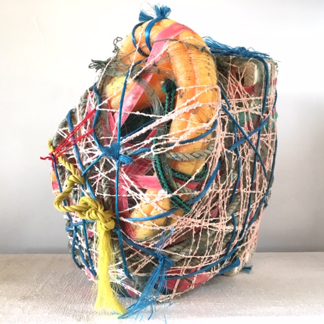
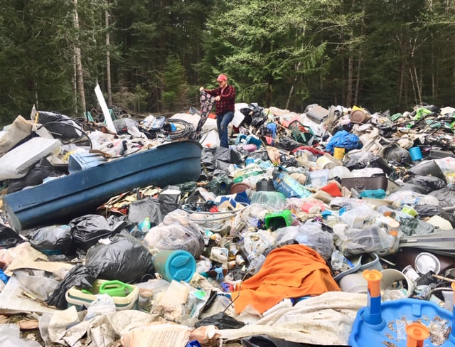
But I can’t settle with just what’s in it for me. Making is my way of connecting with the world. Much of my work is collaborative, so those involved naturally have a stake in the final projects. Often that’s in the gathering of abject materials, or the actual simple hand-working methods that bring folks together. So it’s easy to see the ‘why’ in these crafted objects and fields; beyond their own resonance they stand as an archive of the social interaction, an artifact of the engagement with materials.
The Circular Thinking series has none of that. Each painting is a singular, intimate effort. It does not reveal any agency embedded in unwanted/useless materials and objects. So in the making, despite the flow part, I feel a whisper of guilt and shame that many women of a certain age might also hear when not doing for others: selfish, self-indulgent, self-absorbed.
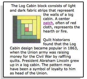
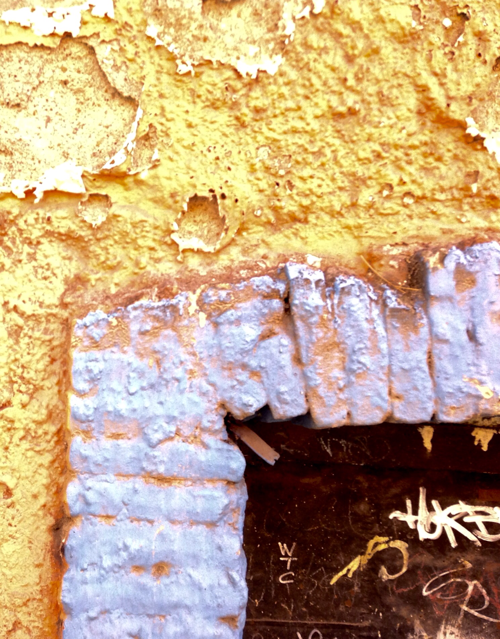
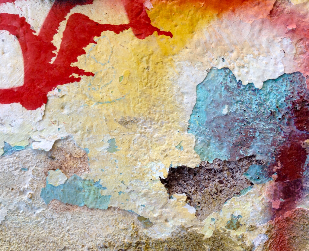
There is definitely something in the ‘self’ there that is the driving force in these improvisational, unpredictable and unsettling paintings: self-care. I ache for solid, reliable ground in these perilous times so I start with a grid, like the criss-cross of rebar that sets the concrete footings in every new tower crowding the Vancouver skyline, or a typical nine-patch quilt block. Nine eight-inch-diameter circles in a 24" x 24" "block" anchor to that grid and then I’m off, free of all straight lines, off-setting those circles by half in paint, offsetting again with more layers of colour in paint or thread until I arrive at an attractive/distractive done-ness. It is an improvisational process of revealing and concealing (repeat!) petal-like sections of circles, creating unsettling, kaleidoscopic fields. It is the kind of all-consuming process that reduces hours to minutes, that absorbs all attention, a safe space away from the visual onslaught of social media, yet reflective of our ‘everything is awesome’ screen-field of vision.
“Why” has always been the trouble. Also aggravating: Why ask why?
This is the reason I’ve named this growing collection of paintings that all basically follow my own set of rules of engagement Circular Thinking. The connotation is negative but hear me out.
Asking ourselves existential questions while we create is infuriating (Shut the hell up, Inner Critic) but it’s also part of a process that can guide us to where we want to land. I would like to be settled with the obvious reason that it’s my route into flow, or actual, real fun. (The “so fun” episode of the We Can Do Hard Things podcast here was recommended to me by my sister.) And they do get me there: into the flow of playing with colours and opacities, of focusing on one stitch at a time, watching how each layer of paint or stitching changes perception.
But I can’t settle with just what’s in it for me. Making is my way of connecting with the world. Much of my work is collaborative, so those involved naturally have a stake in the final projects. Often that’s in the gathering of abject materials, or the actual simple hand-working methods that bring folks together. So it’s easy to see the ‘why’ in these crafted objects and fields; beyond their own resonance they stand as an archive of the social interaction, an artifact of the engagement with materials.
The Circular Thinking series has none of that. Each painting is a singular, intimate effort. It does not reveal any agency embedded in unwanted/useless materials and objects. So in the making, despite the flow part, I feel a whisper of guilt and shame that many women of a certain age might also hear when not doing for others: selfish, self-indulgent, self-absorbed.
There is definitely something in the ‘self’ there that is the driving force in these improvisational, unpredictable and unsettling paintings: self-care. I ache for solid, reliable ground in these perilous times so I start with a grid, like the criss-cross of rebar that sets the concrete footings in every new tower crowding the Vancouver skyline, or a typical nine-patch quilt block. Nine eight-inch-diameter circles in a 24" x 24" "block" anchor to that grid and then I’m off, free of all straight lines, off-setting those circles by half in paint, offsetting again with more layers of colour in paint or thread until I arrive at an attractive/distractive done-ness. It is an improvisational process of revealing and concealing (repeat!) petal-like sections of circles, creating unsettling, kaleidoscopic fields. It is the kind of all-consuming process that reduces hours to minutes, that absorbs all attention, a safe space away from the visual onslaught of social media, yet reflective of our ‘everything is awesome’ screen-field of vision.
It might be easier to eat this elephant one bite at a time by knocking down specific why-questions:
Why paint?
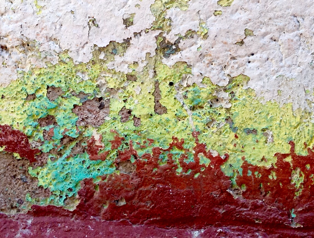
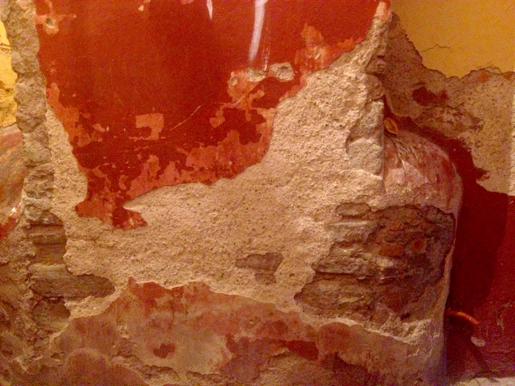
Colour-play. Especially important in this watery corner of the world. It can also act as a dye/stain.
Why canvas?
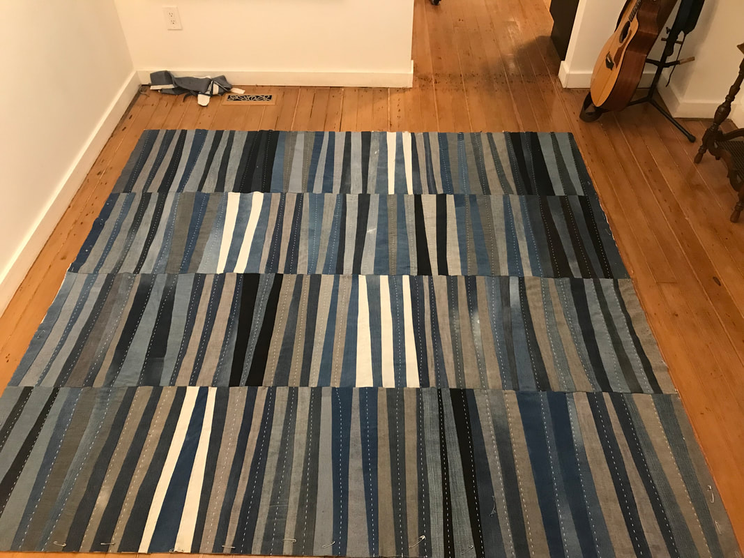
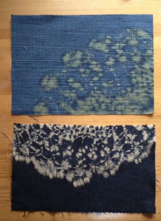
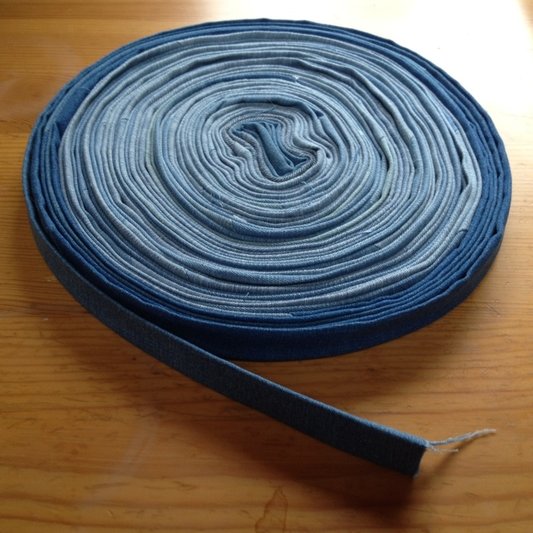
It’s fabric, with so much possibility for exploring its essential characteristics.
Why the wood stretcher?
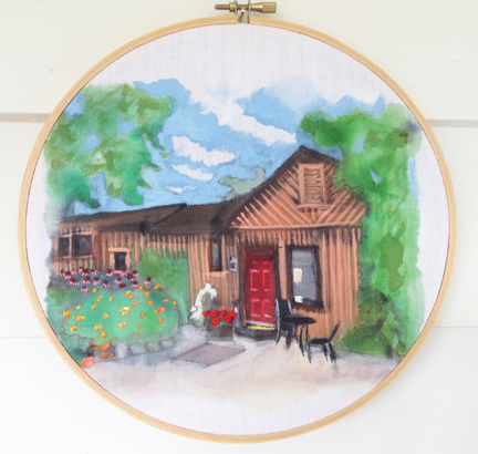
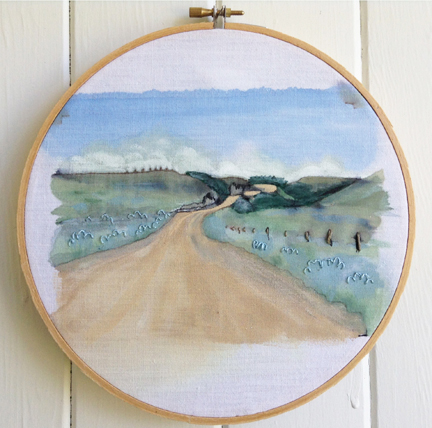
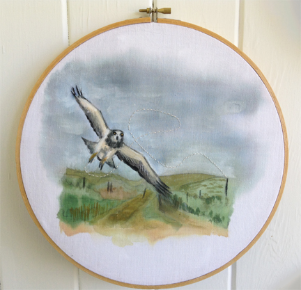
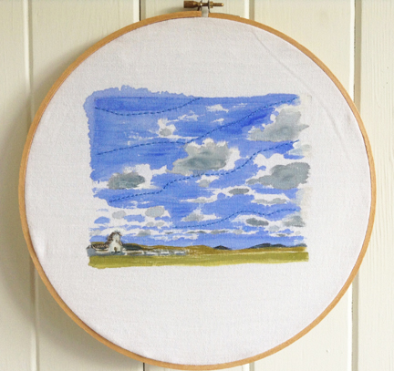
Another fibre product that is a natural with fabric. It's basically a quilt frame or embroidery hoop for painters. Building stretchers and stretching the canvas is an investment in the project ahead (a trick I learned from my father @dennisyandle).
Why the stitching?
I like to needle at the hierarchy of painting over craft processes. Each stitch feels like I’m sticking it to convention. Stitching into painting offers the digestible label of “expanded painting practice.”
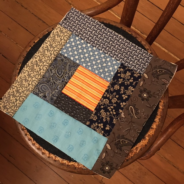
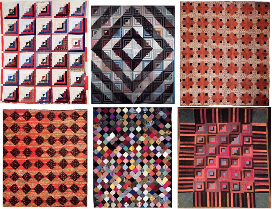
Why all the quilt references?
The geometry of quilt designs is fascinating, mesmerizing. I have little aptitude but a lot of respect for the beauty of mathematics. The tactility of that geometry connects to present and past makers of objects that exist as art pieces or as items of comfort, utility and gifts, an expression of love. This is a less-digestible "expanded quilting practice": improvisational, mixed-media works with none of that cushy filling.

The geometry of circular quilt designs remains a beautiful, captivating mystery.
Why this scale?
24" x 24” is my standard sample-block size. I dream of an exhibit of all my sample blocks blanketing white-cube gallery walls.
Why two-dimensional?
Closer inspection reveals the third dimension, in the stitching. Also, the aforementioned sample-block dream show is a three-dimensional, immersive space of pattern and colour chaos. (I want to go to there.)
Circular Thinking is both the name of this latest series of grid paintings and shorthand for how I approach every new project: play, think, write, share, think, research, share, write, repeat.
Through this writing part of that feedback loop I can see I just might stop torturing myself with the existential Why and get back into that flow.
@carlynyandle


 RSS Feed