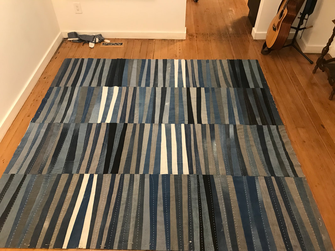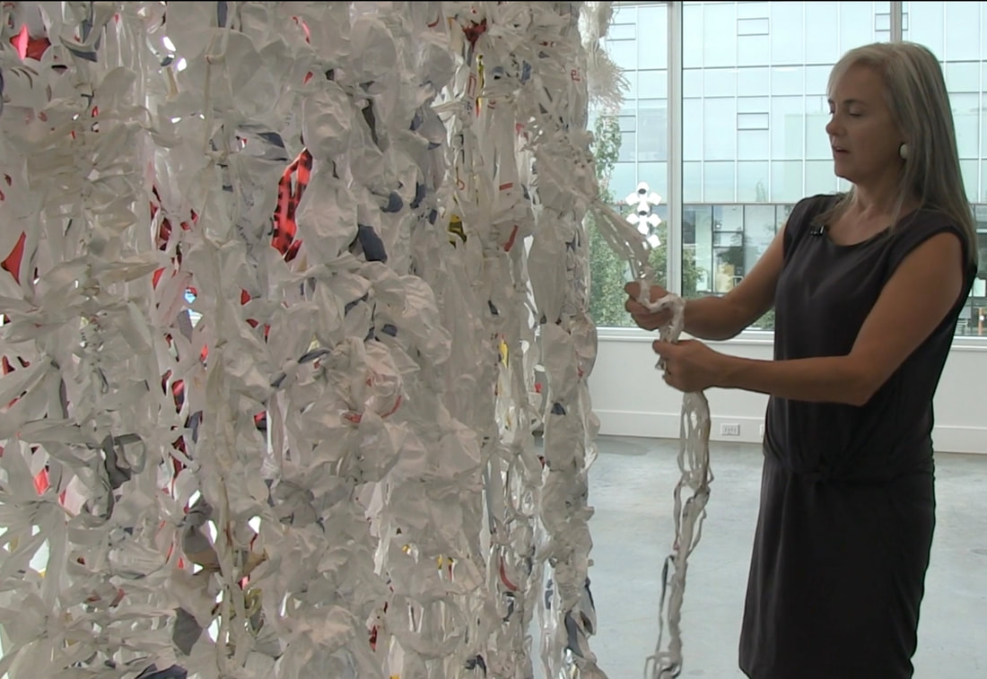
 Click HERE for a 10-minute journey through the methods and motivations behind this MFA thesis. (Film made by Ana Valine, Rodeo Queen Pictures, August 2020)
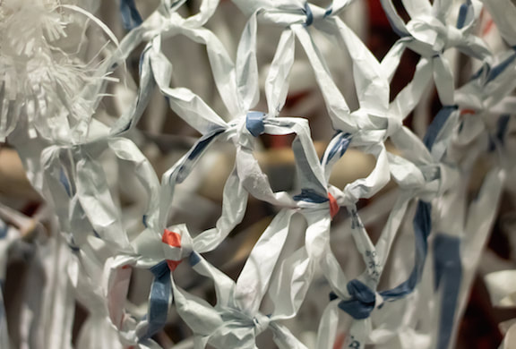
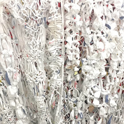
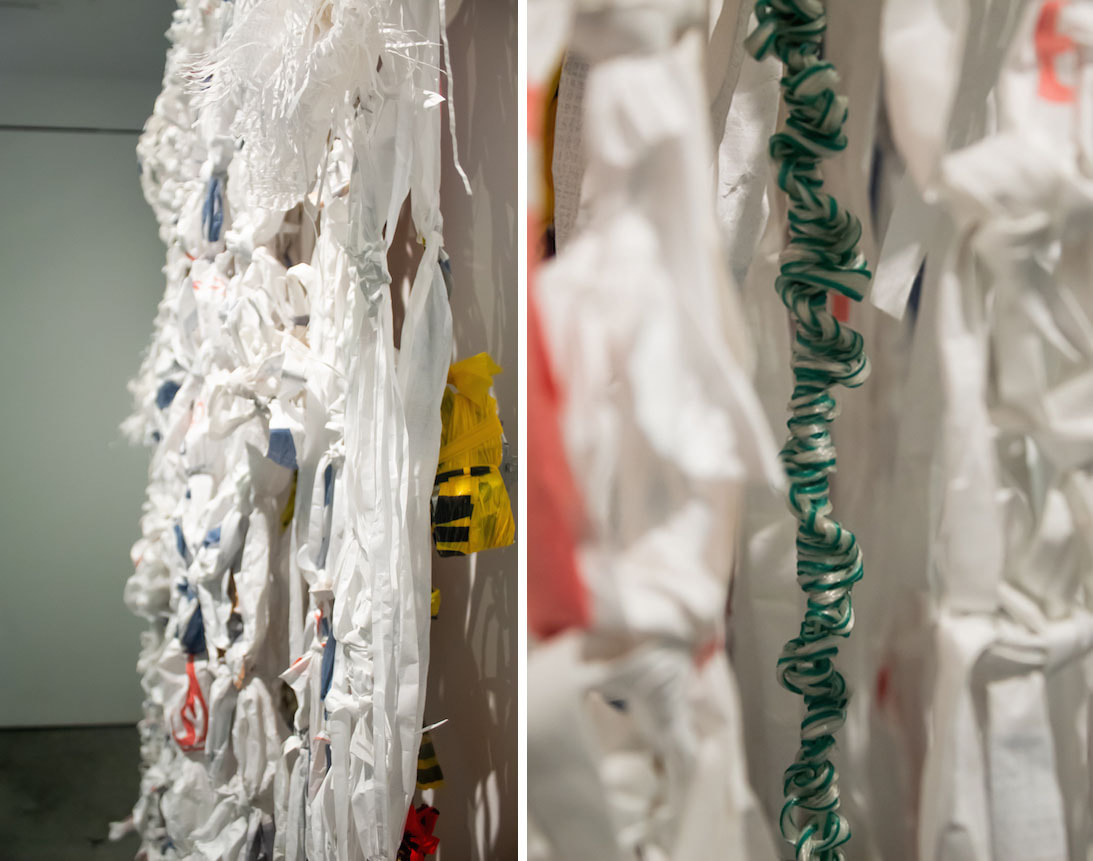
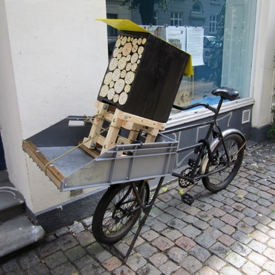
The brilliant part about being an aging female is your growing self-acceptance. Maybe this is because you don't feel that ever-present gaze anymore so you’re not feeling as judged. Or maybe it’s because you’ve just had enough of all that and it’s tiresome and dammit you like to be cozy so screw them. Part of my self-acceptance is stepping out of the ‘should-storm’ of art-making and doing what I love to do with my hands: hunting down materials that have already had their first use and playing up their inherent qualities through knotting, weaving, tying, stitching and binding. I want to work repetitively, easily, without technological assistance and without haste or waste. And in doing so I’m carving out space and time to calm down, reflect and to think deeper — more crucial as the distractions threaten to take over. 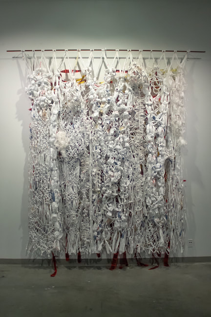 Nate Yandle photo Nate Yandle photo In this way the work is not just in the form or connotations but the well-being and challenge that is relatable to makers who may or may not self-identify as artists. Wrapped up in there are issues of endurance, innovation, history of labour, the learning of the skill, dedication (and frustration), the specific culture and history of the method, the muscle memory that extends back to childhood, and the relationships built through the gathering of the materials. Through this making I make some hay over the established boundaries between the privileged art world and real life, between craft and sculpture, between tactile and political action. Scaffolds is composed of found spun-polyester building wrap, tarp and nylon cord over an armature of waste construction materials including caution tape, PVC piping, rebar, conduit, baling wire, and junction boxes, all attached through simple knots. Special thanks goes to the construction workers who delivered these materials from their many jobsites to my studio for my useless work with many functions. 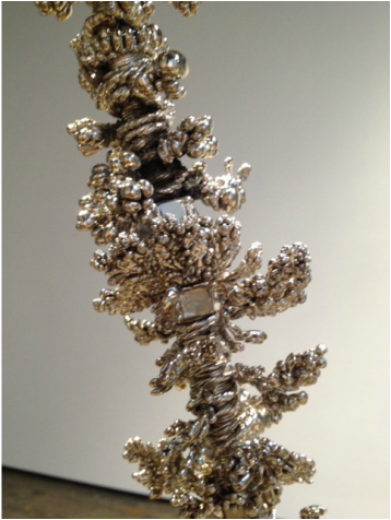 Vancouver-based creative force Omer Arbel and Monte Clark teamed up to embrace the power of happy accidents (Carlyn Yandle photo) Vancouver-based creative force Omer Arbel and Monte Clark teamed up to embrace the power of happy accidents (Carlyn Yandle photo) Last week Monte Clark gave four of us some insight into how an experiment by Omer Arbel went awry and ended up as a dazzling installation in his newish Monte Clark Gallery. The heavy, glittering swags appear as silver-dipped coral or precious Crown hardware retrieved after a palace inferno. The hardened bits of chaos are a dazzling example of why failure is vital in the push for new ideas and materials. "Failure is a constant companion," says Vancouver-based creative force Arbel, in Vancouver Magazine. It was the perfect preface for my '3 artworks a day for five days' challenge that bounced over to me on Facebook. Risk is essential in my work but I don't have Arbel's creative empire to absorb expensive failures, so I turned to stuff lying around the house (a.k.a. Found Domestic Materials) in my thrice-daily experiments. The way I see it, the materials used below were already deemed waste, so if the tests didn't work out, so what? At least no new materials were harmed in the making. Day 2:Day 3:Day 1:Day 4:Day 5: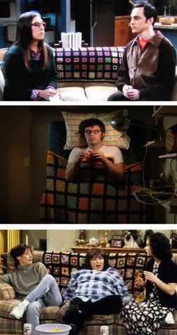 Maybe it's the chilly monochromatic climate at work here, but I'm suddenly wrapping myself up granny squares. The more I think about them, the more potential I see. There's a lot of culture woven into those fuzzy little colour grids. They're there in the background of popular culture, infusing irony and cozy home-yness, nostalgia and disdain. One graces the couches of neuroscientist Amy Farrah Fowler's nerdy apartment and Roseanne's working-class house. Jemaine sleeps under one (badly). Sure, they achieve that soupçon of shabbiness or tastelessness essential to the story but those set decorators are no idiots; granny squares inject hits of high colour and pattern to the visual field. They are trippy, decorative non-decor objects. Their form is used because of their assumed function over form. 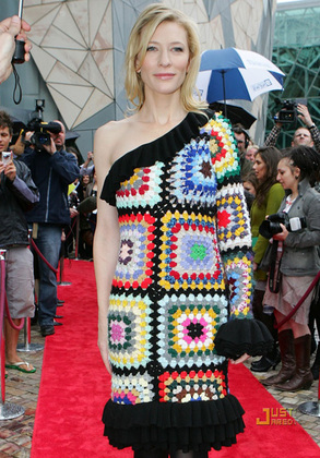 They are the throws that are thrown around, their colourful geometry reflected and refracted so that they radiate western domestic culture, love it or hate it. Cate Blanchett adorned a designer version on the red carpet, to a chorus of derision by the fashion police, which secured the actress more publicity. There's something delicious in the mix between haute couture and the easy, scrappy crochet method that results in over 13,000 Etsy items under the search term, "granny squares". I've loved/hated granny squares ever since my cousin and I were given matching shrink vests at age 10, from our moms. I would have been wearing that single, large purple granny square at a time when the Italian dads in the neighbourhood were setting up that granny-square pattern in concrete breeze walls around their brand new Vancouver Specials. 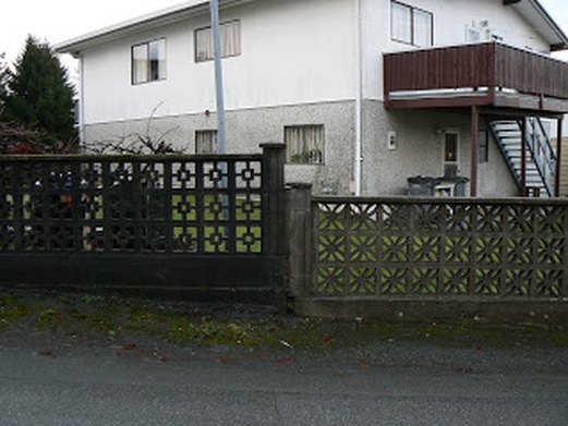 One breeze wall in a photo essay by the author of joy-n-wonder.blogspot.ca One breeze wall in a photo essay by the author of joy-n-wonder.blogspot.ca Like the blankets, the breeze walls evoke utility and thrift but are visually interesting enough to warrant new consideration. The modularity of granny squares and breeze-wall blocks ooze with potential, especially as a mash-up. Granny squares command attention. The Los Angeles Craft and Folk Art Museum took on new dimensions when it was covered in thousands of donated granny squares as part of its CAFAM Granny Squared installation a couple of years ago. 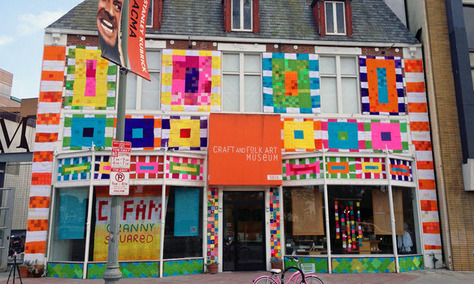 Suddenly, a city that is generally at odds with notions of the handmade, the domestic and the artisanal was attracting mainstream media attention for its collaborative crocheted culture jam. A couple of years before that, in 2011, members of many Finnish women's organizations and the craft teachers' union blanketed Helsinki Cathedral's steps in 3,800 granny square tilkkupeitosta (Finnish for 'quilt'). 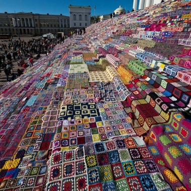 The modular motif marries beautifully to existing architecture, as the granny squares take on a Tetris effect, cascading down to the giant public square in this domestic intervention. But what about the granny square as a building block itself? What if a building appeared to rise out of a giant crocheted coverlet? How could concretized crocheted granny squares be utilized as sculpture? It's a fuzzy concept worth building on. 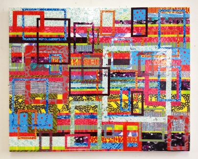 Distracts #1, 2014, acrylic on canvas, 33"W x 27"H. Distracts #1, 2014, acrylic on canvas, 33"W x 27"H. To me, the easiest part about carving out a place in the visual arts world is writing something about it. Yet most of my artist colleagues don't know how I make myself do it on a weekly basis. Easy. It only took 20 years of deadline writing for newspapers. 'Easiest' isn't quite the right word; it's more like 'reliable.' I can rely on the fact that if I sit down at a blank screen, soon words will link into sentences, inspired and connected by images. It's really just a habit at this point. If I don't get the chance to try to make literal sense of the past week, things start to swirl up into a ball of confusion. But once it's out there, it's done and I can move on. 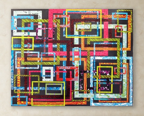 Distracts #2, 2014, acrylic on canvas, 33"W x 27"H. Distracts #2, 2014, acrylic on canvas, 33"W x 27"H. If only my days at my shared studio were as reliable. I wish I could start the morning with the same confidence as I stare at the freshly gesso'd blank canvas, and have the same conversation I get from writing a column (okay, blog). The two sides of my brain do not dance together at the studio. I do not enjoy the small eureka moments of understanding, or any great leaps forward in concept. And unlike weekly writing, I can't see that I'm creating any history of my process/progress. 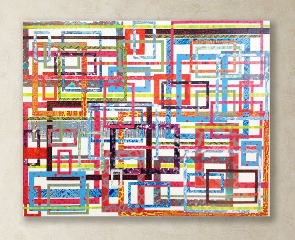 Distracts #3, 2014, acrylic on canvas, 33"W x 27"H. Distracts #3, 2014, acrylic on canvas, 33"W x 27"H. Some days I feel like I'm just painting myself into corners, or cycling back to where I started months ago. I often need to call in the reinforcements — artist friends — for a studio visit, when I ask, "Am I flat-lining here?" or "Am I a one-trick pony?" But words work for me. Letters soon coalesce into strands of ideas and at the moment of this writing I see one taking shape as I type, and drop in these images of my latest paintings. 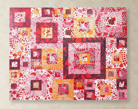 Distracts #4, 2014, acrylic on canvas, 33"W x 27"H. Distracts #4, 2014, acrylic on canvas, 33"W x 27"H. This much I know is true: This is the most distractive time in human history and I live in a neighbourhood that is arguably the nation's capital of everything yoga. As I ride to the studio, I'm generally pre-occupied with this idea of the swelling dedication to personal, meditative practice juxtaposed with the seduction of our screens and the growing realization that our personal identities can be stolen in a click of a button. 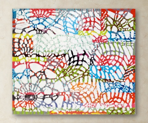 Distracts #5, 2014, acrylic on panel, 14"W x 16"H. Distracts #5, 2014, acrylic on panel, 14"W x 16"H. I think about how we crave peace of mind and heart but are captivated by the fantastic and unfathomable, packaged in high-def or in 3-D, with same-day shipping, something to Like, Share, Tweet, and post to Instagram/Tumblr/Pinterest. Some days at the studio I just need to retreat, retrace past meditative practices, like lace-making. Other days I need to represent the fracturing of that focus. If painting really is a conversation the painter has with the materials, surface, technique and image, I'm seeing that this is talking about mapping out an understanding of the here and now, where words fail. 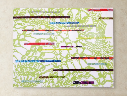 Distracts #6, 2014, acrylic on panel, 16"W x 20"H. Distracts #6, 2014, acrylic on panel, 16"W x 20"H. It's somewhere in the uneasy spaces between the digital and the handmade, the personal craft expression and the art and decor industry. Put into words, it's a little terrifying to be in unexplored territory with no obvious path ahead. I'm just bush-wacking, looking for a clearing. With the same anticipation as a root canal I plopped down in a chair at the accountant's office. Then gasped and pointed, then tried not to point at the adjacent bookcase stuffed with client files. The accountant flipped through my own paperwork. I flipped out my phone and hit the camera app while nodding vaguely. 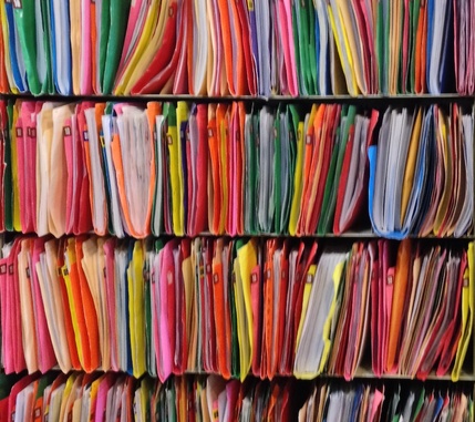 Carlyn Yandle photo Carlyn Yandle photo You can have your heli-skiing, your chemically-enhanced club nights, your YouTubed jack-assery; my exhilaration comes from being confronted by these breathtaking visual moments. The effect is enhanced by the purity of the completely uncontrived art object or visual field in its incongruous environment. Never mind this delicious chrome-y palette that is simply a coded filing system; the whole filing...uh, object radiates with the yearly summations of individuals' spending and earnings, losses and gains that mean everything and nothing. Each colour-bound bundle evokes the stress of tax filing, of legitimizing one's existence, of facing up to the obligation of submitting and committing and remitting, of coming clean or engaging in some white-collar-cheating — or of the quiet shame in not managing to do this whole filing thing on one's own. (That can't just be me.) All that emotional intensity bundled and stacked and gridded is powerful stuff, but it also feels old timey, almost nostalgic now that we are squinting at the brightly-coded visual depictions in the dawn of big data. The non-object colour fields of information are persuasive and invasive, even in my own studio work. (Below: two paintings in the developing Fabrications series of acrylic on canvas.) Digital imagery may boast sophisticated information (and limitless space) but the overstuffed file-pile at the accountant's resonates with heft, weight and compression. It's also heavy with 'the hand': the human activity of handling files, cases, persons. Everything is awesome, as the kids insist on singing post-Lego Movie. But the relentless data-scene enhances other accidental art objects that are in opposition to lurid digital fields. I get the same visual slam when I see it in the concrete cracks between the glass condo towers, or, below, somehow blooming where they are not planted under an off-ramp and against a sub-station wall. 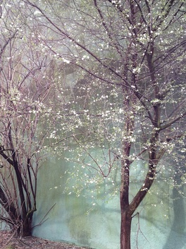 Carlyn Yandle photo Carlyn Yandle photo These filigree moments of respite also manage to infuse their way into my own work, quite unconsciously. It is only in hindsight that I see the impact of these accidental artworks. (See Grey Lace, below and a video documenting the making of this painting.) Another lesson in the notion that art makes the artist. 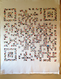 After three months of sewing one donated button after another into a giant QR code, the big moment arrived this week: time to stand back and scan that baby with a reader app, translating this quilt-thing to read, "The devil is in the details." Except it didn't read. Don't panic!, I thought, then spent the entire next day working with a photo image of the QR Button Blanket, Photoshopping in more buttons and darker buttons and bigger buttons, trying to add the minimum amount of density for the software program to register the pattern and work its magic to produce the punchline. No luck; even a sliver of white in one button cluster puts a wrench in the wholecloth works. I filed this one under the category of Epic Fail, not worth finishing it as intended, framing it in black bias binding. I do not want to create something that is 'still' good; I want the thing to be good, full stop. 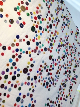 Failure demands confronting the why. Why conceive such a laborious, risky project in the first place? Why endure the painstaking process when half-way through it was becoming abundantly clear that this was not going to 'read'? But there is another power here, and that's tied to the process beyond the product. The achievement may lie in the endurance (in an increasingly A.D.D. world) that is not necessarily attached to the product after all. It may be in seeing it through, without the promise of a sure result. The power may lie in the humble, everyday materials and the community of women who contributed all those bits of plastic saved from the waste stream. (There should really be a global ban on production of billions of plastic buttons. Plant-based plastic, bone, wood, and leather- or fabric-wrapped tin buttons eventually return to the earth.) But what's really starting to click in for me is the cultural reference of this button-grid design. A decade ago, it might have been viewed as an oddly arranged colour field or an abstracted grid but we're so acclimatized to codes that the pattern begs to be 'read.' The fact that this is irresolvable might be annoying. And that's interesting. 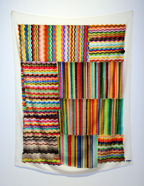 Wavy Gravy, marker on synthetic velvet, 58" x 43" Wavy Gravy, marker on synthetic velvet, 58" x 43" The possible multiple references could be more engaging than the one answer provided by a QR reader app. There's something to be learned in the discomfort of the open-endedness. Moments like these, I seek out the artists who have embraced what New York artist Polly Apfelbaum calls the 'tough beauty' of visually exciting works that incorporate everyday materials in surprising ways. Apfelbaum, who calls herself a bad crafter, articulates the process of hard work in this video. "I work all the time," she says, without a schedule and in a highly experimental way. "You make the work and then you hope for the best." "It's very important to get your fuck-you back." I'm going with that. 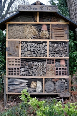 My mind has been buzzing with thoughts of legendary environmentalist-artist Joseph Beuys as I've been hatching an idea for a public artwork that is not so much intrusive as inclusive, especially if you're a native mason bee. It is the convergence of my love of patterns of circles within circles and my growing understanding of the immense value of the Blue Orchard (aka Osmia) Mason Bee. This non-stinging little guy gets up early in the season, collects nectar and spreads pollen at the same time, and is a workhouse in the pollination business compared to the introduced honey bee. Like most of us, Blue Mason Bees live on their own but are gregarious except their preferred condo complexes are holes in wood. It turns out they also live quite nicely in paper straws that are closed at the back end. Artists/gardeners/environmentalists/industrial designers have been innovating ways to boost the population of mason bees in response to colony collapse of the honey bee. Condo complexes set up in the Jardin du Luxembourg in Paris (above) and in the Paris Botanical Garden provide real inspiration, as do the smaller mobile homes, like the one below in Copenhagen. 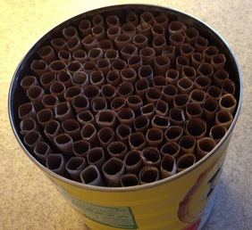 Carlyn Yandle photo Carlyn Yandle photo I've been experimenting with making the straws (see video at bottom) with an emphasis on design, found materials (paper bags and coffee cans). Now for a little colour. My theory is that bubble tea straws could provide just the right waterproof structure for accommodating all those straws the females pack with cocoons. The straws would be easily removed and the cocoons harvested, cleaned and stored in the fridge for the winter, ready to be set out next spring. I have no idea whether this will work, but the creative process is one of problem-finding and problem-solving. 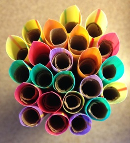 Carlyn Yandle photo Carlyn Yandle photo The plan uses the colourful clusters of the translucent angled straws because they provide built-in overhangs for each condo while allowing for the necessary south light to hit each doorway. The clusters-within-cluster design of fiber-optic cables (see below) sets the pattern course in a design that moves from pinky-finger width to something on a grand scale that can be seen from a block away by humans. It's one of those situations where it will take some doing to get to some knowing. 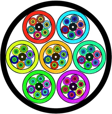 Cross-section of a fiber-optic cable Cross-section of a fiber-optic cable 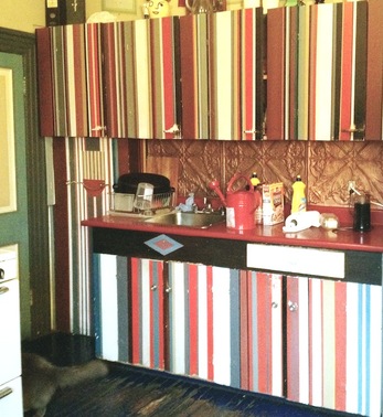 Carlyn Yandle photo Carlyn Yandle photo This is clearly not a staged photo. Pretty much every rule of home decor is ignored here in this old East Van house. And that's why I love it. Maybe it's the weather but I've just about had enough of the grey-washed matte-bland interiors that we are supposed to love to live in. Where is the love in all those glassy surfaces and matchy-matchy square furniture? Various people and their various pets and their various collections have lived in this place for a century. The walls (and doors and kitchen cupboards and floors) do talk. They speak of the current long-time owner's love of old things, and his appreciation of the presumably impulsive work of his artist friend who painted the large Winnipeg Jets logo right smack dab in the middle of the original fir wood floor in the kitchen. It's a home with an open-door policy. Drop by anytime. If it's late Sunday afternoon, you might be absorbed into dinner arrangements, which are kept loose; you never know who's going to show up. There are a lot of stories. 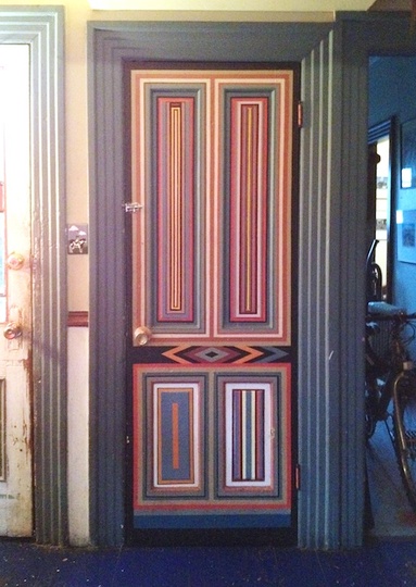 Carlyn Yandle photo Carlyn Yandle photo This door off the kitchen says something about the painter who did it (not to anyone's plans or specifications) and the owner-friend who digs it (and the painter). To anyone else it can be enjoyed as an example of painting itself. It can take the viewer to Frank Stella and the school of minimalism that relied on the physical limits of spaces to define the abstracted field; in this case, the inset panelling on the original door to the basement. Its dynamically asymmetrical pattern also speaks to quilting and other fiber arts. It's all part of a time-based dwelling-sculpture that is growing in layers over the decades, a living gallery of collaborative mark-making by those who have contributed to the social activity therein. The only thing that's inappropriate at this old house is the kind of fetishistic order as seen in virtual tours of display suites in a city seized by its speculative real-estate boom. Those investment-unit surfaces have nothing to say besides 'new' and 'generic.' This place gives new meaning to 'open house.' 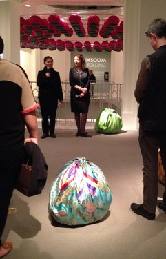 Kimsooja with curator Daina Augaitis Kimsooja with curator Daina Augaitis Internationally renowned artist Kimsooja was verklempt at the opening reception for her show, Unfolding, at the Vancouver Art Gallery Thursday. Her audience would soon feel that emotion unfolding as the soft-spoken artist led a tour of the new exhibit that runs to Jan. 26. Revisiting some 30 years of her deeply personal works, with her son and other close family and friends in attendance, was clearly overwhelming for the Korean-born New York artist , who recently wrapped up another wrapping at the Venice Biennale. 'Overwhelming' is a good descriptor for the show, too. Bright, satiny boulder-like mounds presented in the Bottari tradition of wrapping gifts in colourful fabrics contain material scraps the artist retrieved from the Tsunami-struck region of Japan. 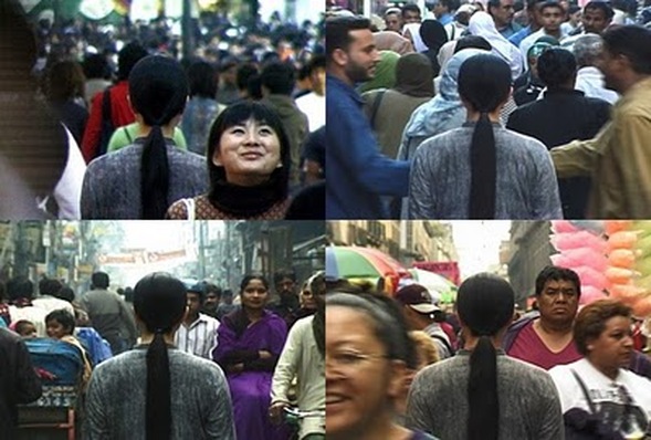 Visitors feel the unfolding of a singular vulnerability in a cavernous room as simultaneous video screenings reveal the artist standing still in a crowded street in various urban corners of the Earth. 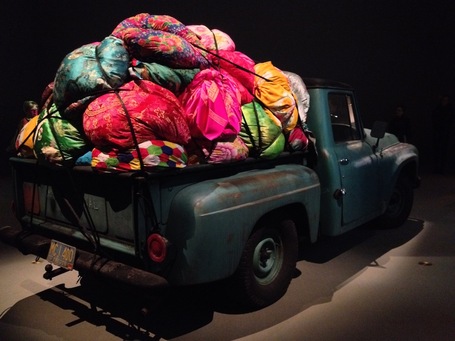 The mix of rusty, worn mechanical objects and brilliant satin fabrics is a visual feast. The mix of rusty, worn mechanical objects and brilliant satin fabrics is a visual feast. Another room featuring truck overloaded with a heap of colours evokes displacement or an unwieldy migration. This retrospective is a reminder of the potency of found fabric, a culturally embedded material that can be a medium for painting or sculpture, often at the same time, as Kimsooja does so powerfully. The artist raises those stakes by making material a metaphor for the wrapping and unwrapping, the enfolding, the unfolding, the concealing and exposing that resonates long after leaving the gallery. A performance of Kimsooja's A Beggar Woman (see video clip, below) is set for Nov. 29 as part of Fuse. |
Sharing on the creative process in long-form writing feels like dog-paddling against the tsunami of disinformation, bots, scams, pernicious sell sites and other random crap that is the internet of today. But I miss that jolt of inspiration from artists sharing their work, ideas and related experiences in personal, non-marketing blogs, so I'm doing my part.
browse by topic:
All
Archives
June 2024
|
 RSS Feed

